Border Radius Generator
CSS Border Radius Generator: Crafting Perfect Curves
The border-radius property is one of the most transformative additions to CSS3. It single-handedly freed web designers from the tyranny of 90-degree boxes and the incredibly painful practice of using sliced corner images to create rounded elements.
Today, border radius is ubiquitous—from the subtle 4px smoothing on corporate buttons to the fully circular 50% profiles on social media. But while a simple border-radius: 8px is easy to type, crafting complex, asymmetrically curved shapes requires mastering a somewhat confusing syntax.
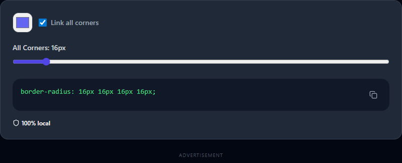
Our visual Border Radius Generator simplifies this process. By allowing you to manipulate each corner individually through an intuitive interface, you can discover organic shapes and copy the exact, cross-browser compatible CSS instantly.
The Evolution of the Border Radius Property
The Basics: Symmetric Rounding
The most common usage of border-radius applies a single, uniform curve to all four corners of an element:
border-radius: 12px;
This shorthand rule tells the browser to draw a circle with a 12-pixel radius at every corner and clip the element's background to that curve.
You can also specify each corner individually using up to four values, operating clockwise starting from the top-left:
border-radius: 10px 20px 30px 40px;
/* top-left, top-right, bottom-right, bottom-left */
The Magic: Asymmetric Rounding
While circles are great, the real magic of the CSS border radius syntax lies in its ability to accept eight values, separated by a slash (/).
This slash divides the horizontal radii from the vertical radii. Instead of corners defined by a perfect circle, they are defined by an ellipse.
border-radius: 50px 10px 50px 10px / 10px 50px 10px 50px;
When you manipulate these horizontal and vertical curves independently, you stop making slightly rounded rectangles and start making organic, fluid "blob" shapes. These blob shapes are incredibly popular in modern illustration-heavy web design, often used as abstract backgrounds behind hero images or profile photos.
Why Use a Generator?
Typing out eight different percentage values and trying to visualize how the browser will render that specific ellipse on a 16:9 div is nearly impossible for the human brain to compute. You have to resort to trial and error, refreshing the browser dozens of times.
Our Border Radius Generator provides:
- Immediate Visual Feedback: Every time you move a slider, the central preview element recalculates instantly. You can immediately see how drastically a corner changes when its horizontal radius outweighs its vertical radius.
- Linked vs. Unlinked Control: A convenient toggle allows you to lock the horizontal and vertical sliders together for classic symmetric curves, or unlock them to explore wild asymmetric geometry.
- Copy-and-Paste Efficiency: The tool continuously outputs the optimized CSS syntax (including the slash notation if you are utilizing asymmetric values) so you can drop it straight into your stylesheet.
Creative Uses for Border Radius
How can you use CSS border radius to elevate your UI design beyond standard buttons?
1. The Perfect Circle (and the Pill Shape)
To make a square image perfectly circular (ideal for user avatars), set the radius to 50%.
border-radius: 50%;
For "pill-shaped" buttons (where the sides are fully rounded but the button is wide), do not use percentages. Instead, use a pixel value much larger than the element's actual height:
border-radius: 9999px;
2. Leaf and Teardrop Shapes
By rounding only two opposing corners, you can create a striking "leaf" aesthetic that works beautifully for stylized icons or map markers.
border-radius: 50% 0 50% 0; /* Leaf */
border-radius: 50% 50% 50% 0; /* Chat bubble / Teardrop */
3. Animated CSS Blobs
One of the most impressive effects in modern web design is a softly animating, amoeba-like blob. You can achieve this entirely in CSS without any JavaScript or SVG by animating between different complex, 8-value border-radius configurations.
@keyframes morphingBlob {
  0% { border-radius: 60% 40% 30% 70% / 60% 30% 70% 40%; }
  50% { border-radius: 30% 60% 70% 40% / 50% 60% 30% 60%; }
  100% { border-radius: 60% 40% 30% 70% / 60% 30% 70% 40%; }
}
.blob {
  animation: morphingBlob 10s ease-in-out infinite;
}
Pro Tip: Use our generator to find two or three visually pleasing asymmetric blob shapes. Copy the CSS for each, and use them as the keyframes for a smooth, organic animation sequence.