Tailwind CSS Button Generator — Create Beautiful Buttons Online
Buttons Are More Complex Than They Look
A well-designed button isn't just background-color: blue; color: white. It needs:
- The right size (padding, font-size, height) for the context
- A hover state that provides clear feedback
- A focus ring for keyboard accessibility
- An active/pressed state for visual responsiveness
- Disabled state styling
- Optional icon alignment
Tailwind makes all of this composable, but composing it correctly from scratch takes time. Our generator does it for you.
Tailwind Button Anatomy
A production-ready Tailwind button typically looks like this:
<button class="
  inline-flex items-center gap-2
  px-4 py-2
  text-sm font-semibold
  bg-blue-600 text-white
  rounded-lg
  shadow-sm
  hover:bg-blue-700
  focus:outline-none focus:ring-2 focus:ring-blue-500 focus:ring-offset-2
  active:scale-95
  disabled:opacity-50 disabled:cursor-not-allowed
  transition-all duration-150
">
  Click me
</button>
Let's break down each layer:
Size Variants
| Size | Classes |
|---|---|
| Extra Small | px-2 py-1 text-xs |
| Small | px-3 py-1.5 text-sm |
| Medium | px-4 py-2 text-sm |
| Large | px-5 py-2.5 text-base |
| Extra Large | px-6 py-3 text-lg |
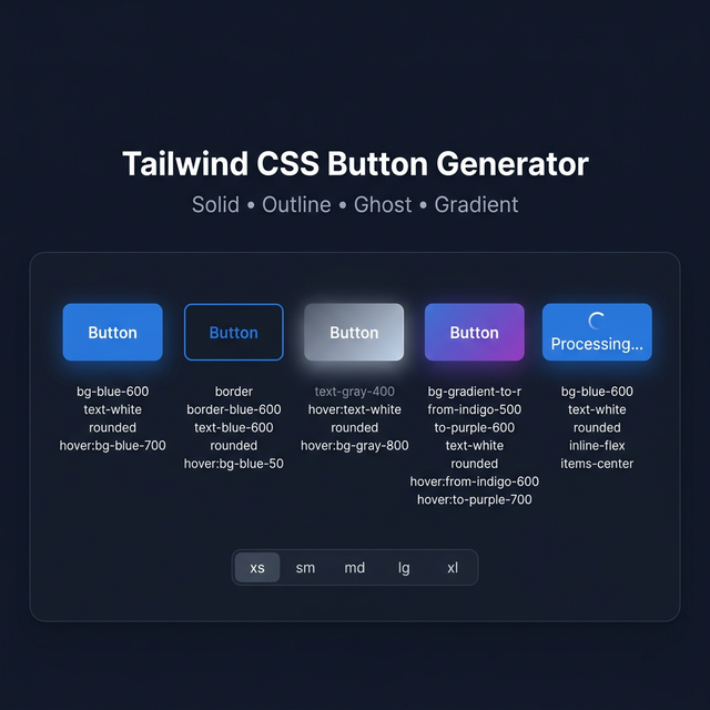
Style Variants
Solid: bg-blue-600 text-white hover:bg-blue-700
Outline: border border-blue-600 text-blue-600 hover:bg-blue-600 hover:text-white bg-transparent
Ghost: text-blue-600 hover:bg-blue-50 bg-transparent
Soft: bg-blue-50 text-blue-700 hover:bg-blue-100
Link: text-blue-600 underline-offset-2 hover:underline
Gradient:
<button class="bg-gradient-to-r from-blue-600 to-violet-600 text-white hover:from-blue-700 hover:to-violet-700">
Focus Accessibility
Every button needs focus styles for keyboard navigation. Tailwind v3 ring utilities:
focus:ring-2 focus:ring-blue-500 focus:ring-offset-2
For dark backgrounds, add focus:ring-offset-gray-900.
Loading State Pattern
<button class="... disabled:opacity-70" disabled>
  <svg class="animate-spin w-4 h-4" .../>
  Loading...
</button>
Related Tailwind Tools
- Tailwind Colors — Choose colors for button variants
- Tailwind Shadow Generator — Add shadow to buttons
- Tailwind Gradient Generator — Create gradient button backgrounds
- Tailwind Card Generator — Build card components with buttons
Recommended schema: SoftwareApplication + FAQPage