Tailwind CSS Card Generator — Build Modern UI Cards Online
•2 min read•100% Client-Side•ToolsHubs Team
#tailwind card generator#tailwind css card#card ui generator#tailwind component builder#tailwind card classes#css card generator#modern ui cards#tailwind card template#tailwind product card#tailwind ui component
Cards Are the Most Common UI Pattern
Cards are everywhere: product listings, blog post previews, user profiles, pricing plans, dashboards, feature highlights. Despite being "just a box with content," getting a card right — padding, shadow, border, hover state, image handling, typography hierarchy — takes consistent attention to detail.
Our generator lets you compose every element of a card and copy the exact Tailwind code.
The Foundation: A Basic Card
<div class="bg-white dark:bg-gray-900 rounded-2xl border border-gray-200 dark:border-gray-800 shadow-md p-6">
  <h3 class="text-lg font-bold text-gray-900 dark:text-white mb-2">Card Title</h3>
  <p class="text-sm text-gray-500 leading-relaxed">Card description text goes here.</p>
</div>
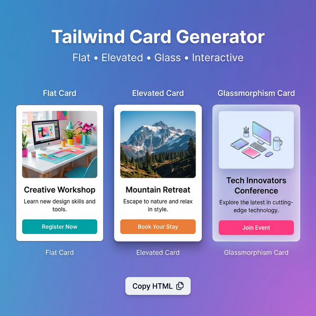
Card Variations
Flat (no shadow, border only):
<div class="bg-white border border-gray-200 rounded-xl p-5">
Elevated (shadow, no border):
<div class="bg-white rounded-2xl shadow-lg p-6">
Glassmorphism (dark mode, blurred):
<div class="bg-white/10 backdrop-blur-md border border-white/20 rounded-2xl p-6">
Interactive (hover lift):
<div class="bg-white rounded-xl border border-gray-200 shadow-sm hover:shadow-lg hover:-translate-y-1 transition-all duration-200 cursor-pointer">
Image Cards
Cover image at top:
<div class="bg-white rounded-2xl overflow-hidden shadow-md">
  <img src="image.jpg" class="w-full h-48 object-cover" alt="..." />
  <div class="p-5">
    <h3 class="font-bold text-gray-900">Title</h3>
    <p class="text-sm text-gray-500 mt-1">Description</p>
  </div>
</div>
Left-side thumbnail:
<div class="bg-white rounded-xl border border-gray-200 flex overflow-hidden">
  <img src="thumb.jpg" class="w-24 h-24 object-cover shrink-0" />
  <div class="p-4 flex-1 min-w-0">
    <h3 class="font-semibold text-gray-900 truncate">Title</h3>
    <p class="text-xs text-gray-500 mt-0.5 line-clamp-2">Description</p>
  </div>
</div>
Badge + Status Indicators
<!-- Top-right badge -->
<div class="relative">
  <div class="bg-white rounded-xl p-5">...</div>
  <span class="absolute top-3 right-3 bg-green-100 text-green-700 text-xs font-bold px-2 py-0.5 rounded-full">New</span>
</div>
Card Footer with Actions
<div class="bg-white rounded-xl border border-gray-200 p-5 flex flex-col gap-4">
  <div>
    <h3 class="font-bold text-gray-900">Card Title</h3>
    <p class="text-sm text-gray-500 mt-1">Description.</p>
  </div>
  <div class="flex items-center justify-between pt-4 border-t border-gray-100">
    <span class="text-xs text-gray-400">March 11, 2026</span>
    <button class="text-sm font-semibold text-blue-600 hover:text-blue-700">Learn more →</button>
  </div>
</div>
Related Tailwind Tools
- Tailwind Button Generator — Create buttons for card CTAs
- Tailwind Shadow Generator — Fine-tune card shadow
- Tailwind Colors — Choose card background and text colors
- Tailwind Grid Generator — Arrange cards in a responsive grid
Recommended schema: SoftwareApplication + FAQPage