Tailwind CSS Colors — Complete Color Palette Reference & Picker
The Tailwind CSS Color System
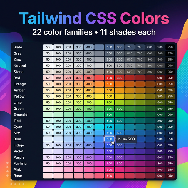
Tailwind CSS includes one of the most thoughtfully designed color palettes in any CSS framework. Unlike Bootstrap's handful of semantic colors, Tailwind gives you a full, mathematically balanced palette of 22 color families, each with 11 carefully chosen shades.
The 22 Color Families
Tailwind organizes its colors into these families:
| Family | Notes |
|---|---|
slate | Blue-gray, popular for neutral backgrounds |
gray | Pure neutral gray |
zinc | Gray with a hint of warm metal |
neutral | Perfectly neutral gray |
stone | Warm gray with sandy undertones |
red | Vibrant, strong red |
orange | Warm orange |
amber | Golden amber yellow |
yellow | Bright, saturated yellow |
lime | Yellow-green |
green | Balanced green |
emerald | Rich emerald green |
teal | Blue-green |
cyan | Bright cyan |
sky | Light, airy blue |
blue | Classic blue |
indigo | Deep indigo-blue |
violet | Purple-blue |
purple | Pure purple |
fuchsia | Pink-purple |
pink | Bright pink |
rose | Red-pink |
The Shade Scale
Each color family has 11 shades:
| Shade | Usage |
|---|---|
50 | Nearly white — backgrounds, hover states |
100 | Very light — section backgrounds |
200 | Light — borders, dividers |
300 | Soft — disabled states, placeholder text |
400 | Medium-light — icons, secondary text |
500 | Mid-tone — default brand color |
600 | Slightly dark — hover variants |
700 | Dark — active/pressed states |
800 | Very dark — headings on light backgrounds |
900 | Near black — primary text on white |
950 | Darkest — dark mode backgrounds |
How to Use Tailwind Colors
Text color: text-blue-500
Background: bg-blue-500
Border: border-blue-500
Ring (focus): ring-blue-500
Divide: divide-blue-500
Gradient: from-blue-500 to-purple-600
With opacity modifier (Tailwind v3+):
<div class="bg-blue-500/20">  <!-- 20% opacity -->
<div class="text-gray-900/80"> <!-- 80% opacity -->
Tailwind v4 Color Changes
Tailwind CSS v4 (2025) introduced a new approach — colors are defined as CSS custom properties using OKLCH color space, making them even more perceptually uniform and allowing easier custom overrides in CSS:
/* v4 style */
--color-blue-500: oklch(62.3% 0.214 259.1);
The class names remain the same, but the underlying values are more accurate across different screens.
Custom Brand Colors
In your tailwind.config.js, extend the palette with brand colors:
module.exports = {
  theme: {
    extend: {
      colors: {
        brand: {
          50: '#f0f9ff',
          500: '#0284c7',
          900: '#0c4a6e',
        }
      }
    }
  }
}
Then use: bg-brand-500, text-brand-900, etc.
Related Tailwind Tools
- Tailwind Gradient Generator — Build gradients using Tailwind colors
- Tailwind Shadow Generator — Add shadows to colored elements
- Color Contrast Checker — Verify accessibility of Tailwind color combinations
- Color Picker — Find custom hex values for arbitrary colors
Recommended schema: SoftwareApplication + FAQPage