Tailwind Flexbox Generator — Build Flex Layouts with Tailwind Classes
•2 min read•100% Client-Side•ToolsHubs Team
#tailwind flexbox generator#tailwind flex classes#tailwind css flexbox#flex layout tailwind#tailwind flex direction#tailwind justify content#tailwind align items#flexbox tailwind tool
Flexbox in Tailwind CSS
Flexbox is the go-to layout system for one-dimensional layouts — arranging items in a row or a column. Tailwind makes it intuitive with utility classes that mirror the underlying CSS properties but with more concise naming.
Enabling Flex and Direction
<div class="flex">          <!-- display: flex -->
<div class="inline-flex">   <!-- display: inline-flex -->
<div class="flex flex-col"> <!-- column direction -->
<div class="flex flex-row"> <!-- row direction (default) -->
<div class="flex flex-row-reverse"> <!-- reverse row -->
<div class="flex flex-col-reverse"> <!-- reverse column -->
Wrapping
<div class="flex flex-wrap">    <!-- wrap to next line -->
<div class="flex flex-nowrap">  <!-- no wrap (default) -->
<div class="flex flex-wrap-reverse"> <!-- wrap in reverse -->
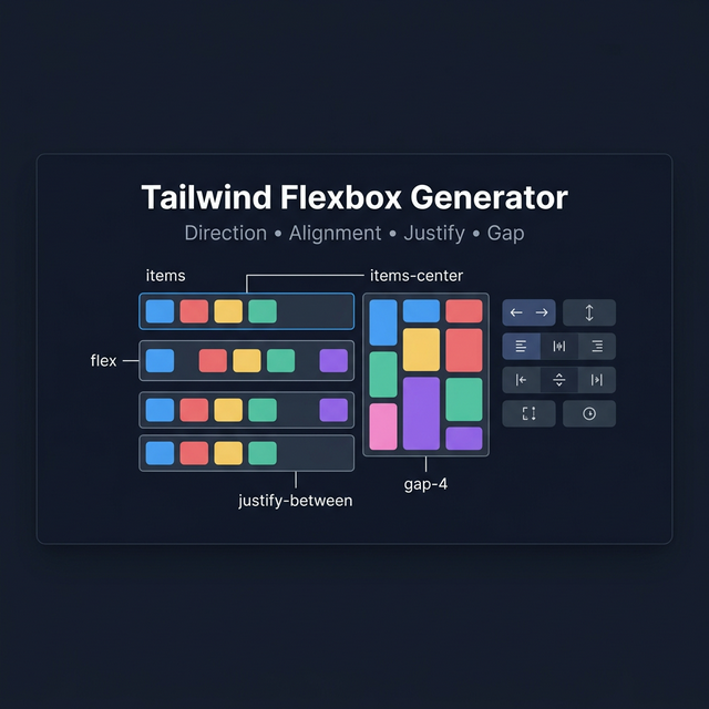
Justify Content (Main Axis)
| Class | CSS |
|---|---|
justify-start | justify-content: flex-start |
justify-center | justify-content: center |
justify-end | justify-content: flex-end |
justify-between | justify-content: space-between |
justify-around | justify-content: space-around |
justify-evenly | justify-content: space-evenly |
Align Items (Cross Axis)
| Class | CSS |
|---|---|
items-start | align-items: flex-start |
items-center | align-items: center |
items-end | align-items: flex-end |
items-stretch | align-items: stretch (default) |
items-baseline | align-items: baseline |
Gap Between Items
<div class="flex gap-4">   <!-- gap: 1rem on all sides -->
<div class="flex gap-x-4"> <!-- column gap only -->
<div class="flex gap-y-2"> <!-- row gap only -->
Gap is the modern replacement for margin hacks between flex items.
Flex Item Sizing
<!-- Grow to fill available space -->
<div class="flex-1">    <!-- flex: 1 1 0% -->
<div class="flex-auto">  <!-- flex: 1 1 auto -->

<!-- Don't grow or shrink -->
<div class="flex-none">  <!-- flex: none -->

<!-- Control individually -->
<div class="grow">   <!-- flex-grow: 1 -->
<div class="shrink-0"> <!-- flex-shrink: 0 (prevent shrinking) -->
Common Flex Patterns
Centered content (horizontal + vertical):
<div class="flex items-center justify-center h-screen">
Space between label and value:
<div class="flex items-center justify-between">
  <span>Label</span>
  <span>Value</span>
</div>
Sticky footer:
<div class="flex flex-col min-h-screen">
  <main class="flex-1">...</main>
  <footer>...</footer>
</div>
Related Tailwind Tools
- Tailwind Grid Generator — For two-dimensional layouts
- Tailwind Card Generator — Flex-based card components
- Tailwind Button Generator — Flex buttons with icon alignment
Recommended schema: SoftwareApplication + FAQPage