Tailwind CSS Gradient Generator — Build & Copy Gradient Classes Visually
Gradients in Tailwind CSS
CSS gradients went from a nice-to-have to a core part of modern UI design. They add depth, dimension, and visual interest without images — and they scale perfectly to any screen size.
Tailwind CSS v3 ships with a complete gradient system based on utility classes. Instead of writing raw CSS gradient syntax (which is surprisingly verbose), you compose gradients from three simple building blocks.
How Tailwind Gradients Work
Tailwind's gradient system uses three key classes:
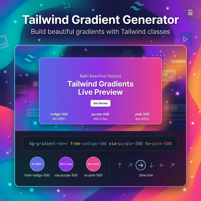
Direction: bg-gradient-to-{direction}
bg-gradient-to-r— left to rightbg-gradient-to-br— top-left to bottom-rightbg-gradient-to-b— top to bottom- And 5 more directional variants (
t,tl,tr,l,bl,bl)
Color stops:
from-{color}— starting colorvia-{color}— optional middle colorto-{color}— ending color
Example: A purple-to-pink gradient:
<div class="bg-gradient-to-r from-purple-500 to-pink-500">
Three-stop gradient:
<div class="bg-gradient-to-r from-blue-500 via-purple-500 to-pink-500">
Tailwind Color Palette for Gradients
Tailwind includes 22 color families (slate, gray, zinc, neutral, stone, red, orange, amber, yellow, lime, green, emerald, teal, cyan, sky, blue, indigo, violet, purple, fuchsia, pink, rose), each with 11 shades from 50 to 950.
That's thousands of possible color combinations. Popular gradient pairings include:
| Name | Classes |
|---|---|
| Ocean | from-blue-500 to-teal-400 |
| Sunset | from-orange-500 via-red-500 to-pink-500 |
| Aurora | from-green-400 via-teal-500 to-blue-600 |
| Cotton Candy | from-pink-300 to-violet-400 |
| Midnight | from-gray-950 to-slate-800 |
| Gold | from-yellow-400 to-orange-500 |
Custom Colors with Arbitrary Values
Tailwind's arbitrary value syntax lets you use any hex color in gradients:
<div class="bg-gradient-to-r from-[#092B55] to-[#F49449]">
This bridges the gap between Tailwind's palette and your brand colors.
Animating Gradients with Tailwind
Tailwind doesn't include gradient animation utilities by default, but you can add custom @keyframes in your config and use animate-* classes:
@keyframes gradient {
  0% { background-position: 0% 50%; }
  50% { background-position: 100% 50%; }
  100% { background-position: 0% 50%; }
}
Combined with background-size: 200% on the gradient div, this creates the popular animated gradient background effect seen on many modern landing pages.
Related Tailwind Tools
- Tailwind CSS Shadow Generator — Add depth with Tailwind shadow classes
- Tailwind Colors Reference — Browse the full Tailwind color palette
- CSS Gradient Generator — Create gradients without Tailwind
- Color Picker — Pick custom colors for arbitrary value gradients
Recommended schema: SoftwareApplication + FAQPage