Tailwind CSS Shadow Generator — Build Box Shadow Classes Visually
Shadows in Tailwind CSS
Shadows are one of the most effective ways to create visual hierarchy — they tell users which elements are elevated (modals, cards, dropdowns) and which are flat (body content). Tailwind CSS includes a complete shadow system with 8 built-in sizes plus drop-shadow filter utilities.
Built-in Shadow Classes
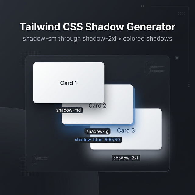
Tailwind's box-shadow utilities:
| Class | Effect |
|---|---|
shadow-sm | Subtle, soft shadow — cards, inputs |
shadow | Default shadow — buttons, links |
shadow-md | Medium shadow — hover states on cards |
shadow-lg | Large shadow — modals, floating elements |
shadow-xl | Extra large — overlays, drawers |
shadow-2xl | Dramatic shadow — prominent call-to-actions |
shadow-inner | Inset shadow — pressed buttons, inputs |
shadow-none | Remove all shadows |
Colored Shadows (Tailwind v3.1+)
One of the most powerful additions to Tailwind's shadow system is colored shadows:
<!-- Blue shadow on hover -->
<button class="bg-blue-500 shadow-lg shadow-blue-500/50 hover:shadow-blue-500/80">
  Click me
</button>
The shadow-{color}/{opacity} syntax lets you match shadow color to element color, creating that premium "glow" effect used on CTAs and gradient buttons.
Drop Shadow vs Box Shadow
Tailwind has two separate shadow systems:
shadow-* (box-shadow): Applied to the element's bounding box. Works on rectangles, ignores transparency.
drop-shadow-* (filter): Applied as a CSS filter — it respects the actual shape of the element, including transparent areas. Essential for icons, PNG images with transparent backgrounds, and SVGs.
<!-- Box shadow on a card -->
<div class="shadow-lg rounded-2xl">
Creating Custom Shadows
For shadows beyond Tailwind's presets, use arbitrary values:
<div class="shadow-[0_20px_60px_rgba(0,0,0,0.3)]">
Or define custom shadows in your tailwind.config.js:
module.exports = {
  theme: {
    extend: {
      boxShadow: {
        'brand': '0 4px 24px -4px rgba(9, 43, 85, 0.5)',
        'card-hover': '0 20px 40px -8px rgba(0, 0, 0, 0.2)',
      }
    }
  }
}
Shadow Best Practices
Use shadows to imply elevation, not decoration. Elements higher in the visual stack should have larger shadows. Reserve shadow-2xl for things that truly float above the page (modals, tooltips).
Pair shadow size with movement. On hover, increase the shadow size and move the element up slightly: hover:shadow-xl hover:-translate-y-1. This mimics physical card lifting.
Dark mode shadows. Dark backgrounds make light shadows invisible. Use colored shadows with low opacity, or use dark:shadow-none and dark:ring-1 dark:ring-white/10 as an alternative elevation indicator.
Related Tailwind Tools
- Tailwind Gradient Generator — Pair shadows with gradients for premium button effects
- Tailwind Colors — Browse colors for applying to shadows
- Box Shadow Generator — Raw CSS shadow generator without Tailwind
- Tailwind Card Generator — Build complete card components with shadows
Recommended schema: SoftwareApplication + FAQPage